

How To Create Cinematic Looking Photographs

Over the past few years, there has been a real shift towards photographers wanting their images to look more cinematic. It’s not necessarily something you will see in commercial photography but on social media, there are countless accounts dedicated to the cinematic aesthetic, and they are incredibly popular! So how do you make your images look cinematic? I took an evening stroll to see what I could create.


It’s important to understand that this look isn’t for everyone and it will not make a bad photograph look better, it’s very much just a matter of taste. The good news is that the look is very desirable and even better, it can make very mundane scenes seem, well like a still from a gritty Hollywood movie, what’s not to like!


At this point, I’m sure many photographers will be rolling their eyes and thinking ‘it’s all been done before’ and I’ve certainly been guilty of wishing an early demise of the ‘Social Media’ fad of basically, trying to make images look like something they are not! However, maybe it’s my old age or my general love for any type of photography, but I’ve actually come around to quite like the cinematic look. So with my camera, a warm coat and a healthy dose of optimism - I set out around the dark streets of Birmingham to get some film-like photographs.

In all honesty, I’ve received compliments on my photos in the past, ‘Looks like something from a film’! Which is always nice to hear, but I really wanted to be more intentional and delve even deeper into the cinematic feel. I knew that there are certain elements that give an image a more ‘film scene’ feel. As I roamed the streets, looking for the perfect subject matter, those elements were running around my mind!
🌅 Getting the right Colour Grade
It is impossible to talk about cinematic feeling images without speaking about the most predominant element that gives an image a cinematic feel, the colour grade. Many photographers, both amateur and professional alike, will be very aware of the importance of colour and the potential that editing software can give us to manipulate those colours. Before anyone attacks me, yes black and white photography is by its nature, the absence of colour - but even black and white can look very cinematic!

However, we will be focussing on colour photography here and referring to the art of adjusting those colours as colour grading. The term itself can be applied to still or moving images, but more commonly used in the world of cinematography. Grading simply means the ‘feel’ that is given to a video or image in post production by using certain colours to elicit certain emotions. OK, so that’s a lot to wrap our heads around, let’s be a bit more specific.

Basic colour theory can tell us how certain colours may affect our emotions and perceptions of a scene. For instance, it’s pretty common to depict a warm scene using oranges and yellows, to imply heat and a cold scene - you guessed it, blues. Colours such as red can imply danger and greens can be calming and relaxing. We can also use multiple colours together to add interest to a scene, splashes of red in a blue scene will draw the viewer's interest to that point. The same red accents may be lost in an orange scene or lose impact.

The art of grading is, in its most simple essence, the choice the creator makes to convey the overall feeling of the narrative for that image or video. But why is grading our images so popular these days? Surely we want to create a true representation of the scene in front of us? Well, my very unscientific take on this is ‘blame social media’. Many of us can list our inspirations not just in the photography world, but that of the world of cinema and social media is awash with people claiming inspiration from the likes of Wes Anderson, Roger Deakins and countless other directors and cinematographers.
Possibly the most enduring ‘grade’ of modern times is the Teal & Orange look - no prizes for guessing the primary colour scheme there and a quick Google search will show thousands of examples of it! This particular look creates depth and can draw the viewer's attention to important aspects of a scene. However, it’s important to remember that just because this is the most popular, doesn’t make it the only scheme we can use and neither does it imply that we need to use such extreme grades, as with everything, less is often more.

So we have established the importance of colour and its impactfulness of setting a mood for our image. But there is more to creating a cinematic feel than simply ramping up certain colours and hoping for the best! Next we will look at choosing the right subject matter in the first place and making the seemingly mundane, well, look magnificent!
🎥 Choosing Cinematic Feeling Subjects
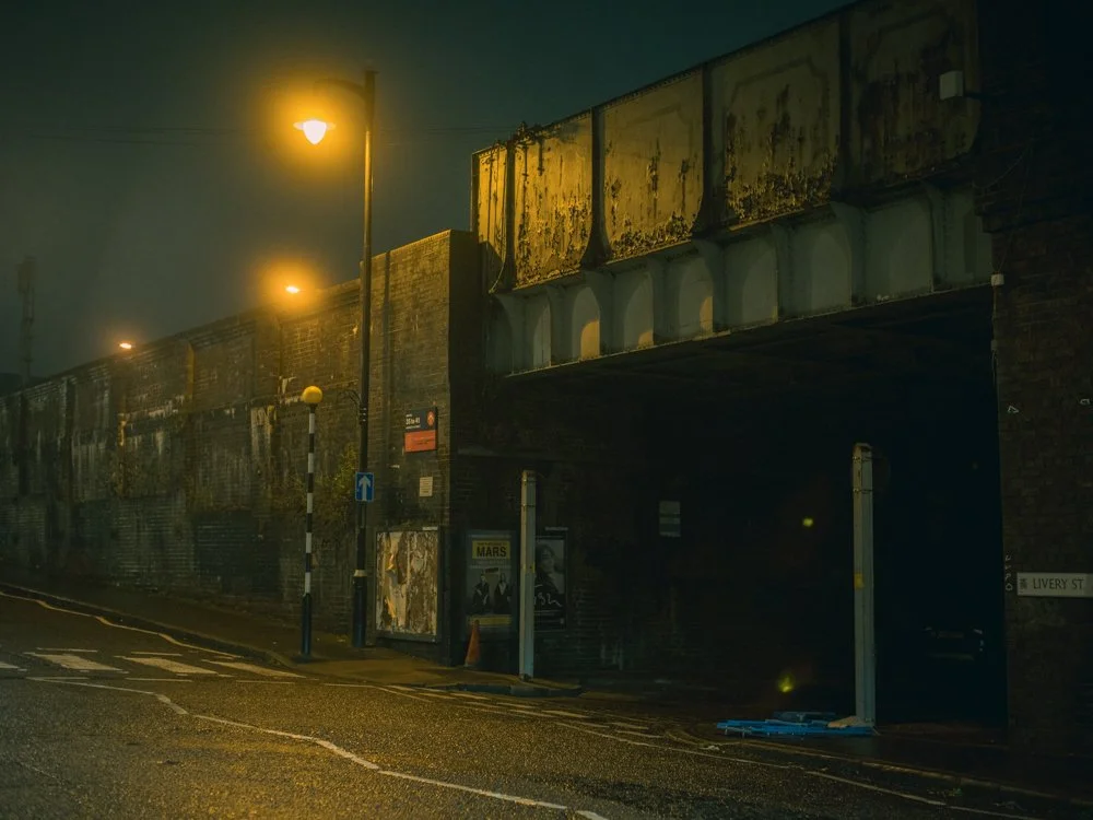
As I continue my walk around Birmingham, I find my eyes are constantly drawn to construction yards, car parks, street lights and any pools of light in the otherwise dreary night. This is where personal taste and opinion play a huge part in choosing the right subject (and where my particular love of the Sci-Fi and moodier feeling films comes into play!) but the mix of metal, flood lights and concrete give me very ‘Blade Runner’ like feels! It’s a stretch, but I did say I was venturing out with a healthy dose of optimism!

Finding scenes that feel cinematic is no easy feat. For a start, one person’s cinematic scene is, well, another’s ‘picture of a crane in rainy Birmingham on a cold, wet Tuesday night’. If cinema has taught us anything, it’s that almost any scene can look cinematic, it is all in the vision of the person creating it. I’m certainly not adverse to photographing on warm sunny days, but I do find I lean towards darker, moodier settings on a regular basis so choosing what time of day and in what weather conditions, is equally as important.
Unless we are heading out with the intent to create one single image, we usually will have a series of images in mind. This can again have an impact on choosing what and where we shoot. Thinking in even broader terms, we will normally be trying to add images to a portfolio and will want to keep a consistent look and feel across those images, this again will influence the kind of subject that we choose to shoot on a regular basis.
🚦 Seeing the light
As I loop around the dark streets and start to head home, I find I’m drawn even more towards the dark corners, single points of light and the soft puddles of illumination glowing on the wet streets. This is no accident, with cinematic feeling images, it’s often what we choose to leave in the shadows that help create mystery and can give the viewer a slightly uneasy feeling of what might be lurking there.


After years of shooting with film cameras and having a particular love of Cinestill 800T (a derivative of a film stock used in motion pictures) I’ve learnt to seek out artificial lighting and to try to replicate the subtle glow or halation created by such film stocks. This certainly was my intent as I walked around, crown to the lamppost and lights from buildings like a crazed photography moth!
Light is the most fundamental part of any photograph but using light to create a cinematic feel is often about the subtraction of that light. I’ll have a friendly bet with you that if you Google the word ‘cinematic’ the kinds of images you find will lean towards the darker, rather than bright sunny days. Again, it’s not to say that bright and light can’t be cinematic, that’s simply not true. But there is definitely a skew towards the notion of a cinematic image having a darker, moodier overall feel.
📸 Bringing the elements together
As I get home, make myself a drink and sit down to edit the images, I feel engrossed in how all of the elements actually come together to create a look, feel and emotion. I frantically move sliders in Lightroom, a little here, a lot there and slowly concoct my interpretation of something I feel has a cinematic feel. Though it won’t be to everyone's taste, for a brief stroll around the streets of the second city, I feel quite happy with the overall impact of the images.

The choice of subject matter, the light and most importantly, the colour grade all come together to give the images a certain feel. Now I am not saying they are anything special, they’re no ‘In the Mood for Love’ - Wong Kar-Wai’s masterpiece! But they have very distinct stylisation that helps the viewer imagine that they could be a still from a film, and I think that is the goal here.

Yes, there are certain aspects that don’t fit so simply into a ‘cinematic’ feel - for instance, I've still stuck with my love of the 4:5 aspect ratio, where a more widescreen ratio would have helped sell the cinematic look. However, photography is all about compromises and I’m afraid I am a little too stuck in my ways!


✅ Final Thoughts
I hope you found some aspects of this useful - there are no groundbreaking techniques here and nothing that hasn’t been done a thousand times before. However, even for someone as stubborn as I am, it’s still nice just to spend an evening trying something a little different and broadening our photographic horizons!
🔴 FAQ: How to Create Cinematic-Looking Photographs (10 Common Questions + Top Tips)
-
It’s rarely one magic slider. The cinematic feel usually comes from a combo of mood, light direction, depth, colour choices, and a frame that feels like a film still — not just “nice photography”.
Top tips:Think scene > subject (what’s happening, what’s about to happen, what just happened).
Prioritise directional light and controlled shadows (mystery sells the story).
Keep the frame intentional: remove the “random clutter” that screams snapshot.
-
Settings help, but they’re not the whole film. If you want the classic cinematic separation, you’re usually chasing shallower depth of field and controlled highlights.
Top tips:Shoot wider apertures when it makes sense (don’t nuke the scene into blur for no reason).
Protect highlights (a slightly darker exposure often grades better for mood).
Use longer focal lengths when you want compression + subject separation.
-
Cinematic lighting is often about shape: where the light falls, where it doesn’t, and what that contrast says. Contrast ratios matter more than “brightness”.
Top tips:Look for single sources (street lamps, window light, doorway spill, car headlights).
Separate subject from background by adding depth (don’t glue them to a wall).
Embrace shadows—cinematic isn’t allergic to darkness.
-
Nope. It’s popular because it can create colour contrast and make subjects (especially skin tones) pop — but it’s not the only way to achieve a cinematic look.
Top tips:Pick a primary mood first (cold, warm, sickly green, sodium-vapour amber, etc.).
Keep grades subtle—a heavy hand can turn “film still” into “preset demo”.
Aim for colour separation (subject vs background), not just “more saturation”.
-
Wide crops help because we associate them with cinema but it still depends on a lot of other things such as subject matter and framing.
Top tips:Try 16:9, 2:1, or 2.35:1 crops and see what fits the story.
Compose with the crop in mind (don’t just chop heads off later and call it cinema).
Use negative space deliberately — it’s powerful in widescreen frames.
-
One of the keys to a cinematic look is the edit. This is where preset packs can help but look to build your own visual style with your edits. Think about the mood that you want to convey.
Top tips:Start with exposure/contrast, then move to colour (don’t colour-grade a mess).
Use curves to shape contrast more gently than the basic Contrast slider.
Use local adjustments (dodging/burning) to guide the eye like a DP would.
-
If it looks like the colour is doing all the work… it’s probably doing too much work. The cinematic feel usually comes from light + composition first, then a supporting grade.
Top tips:If skin tones (or neutrals) look weird, pull it back.
Reduce clarity/texture strategically (don’t smear the whole photo).
Compare with the unedited shot: you want a film mood, not a new planet.
-
Whatever helps you tell the story — but generally, lenses that give you subject separation, pleasing falloff, and control over perspective make life easier. (And no, you don’t need “cinema glass” to be cinematic.)
Top tips:For portraits/scenes: try 50–85mm for separation and compression.
For environment + story: use 24–35mm, but watch edge distortion.
Don’t forget distance: stepping back and zooming in can look more “filmic” than standing close on a wide lens.
-
Film character is usually a light touch: subtle grain, gentle highlight roll-off, and a hint of glow when it suits the scene.
Top tips:Add grain last, and keep it believable (fine grain > sandstorm).
For glow/halation, target highlights only (don’t fog the whole image).
If you love night scenes, practical lights + a gentle bloom can be chef’s kiss.
-
The ones that already have mood baked in: strong light sources, texture, weather, reflections, and a sense of “what’s going on here then?”
Top tips:Hunt for pools of light (street lamps, shop windows, car parks, doorways).
Wet streets, fog, steam, neon, construction yards… all ridiculously cinematic if you frame them well.
Build a mini-series: 6–12 images with a consistent mood reads more “film” than one random banger.
-
One clear subject + one clear mood
Directional light and purposeful shadows
Depth (foreground / subject / background)
Colour palette that supports the story (not fights it)
Crop/composition that feels like a film still, not a happy accident

About the Author - Ross Jukes is a professional Photographer and Videographer with over a decade of experience. Working in both Digital and Analogue formats, Ross has worked with international clients, had his worked published numerous times and exhibited his work extensively. With a passion for all things photographic, Ross combines his experience, enthusiasm and dedication to his art form to create engaging and educational content for the photographic community.
Disclaimer: All links to Amazon UK/US are affiliated links - you will still pay the same price but I will receive a small commission for providing the link. All information provided in this blog is intended either for educational or entertainment purposes and is accurate to the best knowledge of the author. However, further research/professional advice should be sought before making purchases/implementing any advice given and no responsibility is taken by the author or parties mentioned here within.